Self-publishing has transformed the book industry, making it possible for anyone to create, publish and sell a book without using a commercial publisher. However, the quality of many self-published books leaves a lot to be desired, and as a result, only a small percentage of self-published books sell in any quantity.
The formatting of your book will play a major part in whether it will be successful or not because it affects both visual appeal and readability. Sadly, many self-publishers fall into the trap of making all too common typesetting mistakes because they have no formal graphic design training.
As a professional graphic designer, my purpose in writing this article is to make you aware of thirteen easily avoidable common typesetting mistakes so that, if you do decide to go down the DIY route, you can still create a book that you can be proud of. Along the way, I’ll try and demystify many of the important typesetting terms than can be so confusing. Understanding these expressions will help you should you decide to work with a professional designer.
1. Too many fonts

Today the internet is awash with a bewildering choice of fonts. Microsoft Word comes with almost 50 fonts pre-installed, and Google fonts offer more than 800 different fonts which can be downloaded for free, and that is just the tip of the iceberg.
As a result of all this choice, it can be tempting to use multiple fonts within your book in an attempting be creative or quirky. Don’t – it just makes your work look amateurish, reduces your credibility, and makes your book harder to read.
Recommendations:
I would recommend limiting your font usage to two or three. This will give your book consistency and a more coherent look. I’ll go more into how to choose those fonts later in this article.
2. Not enough/too much leading

Leading (pronounced “ledding”) is the term professional typographer’s use to describe the spacing between lines of text. The name is derived from the lead shims that were once inserted between rows of movable typeset characters before the advent of digital printing.
Most word processing programmes will refer to it simply as “line spacing” and allow you to choose from a limited range of preset values such as 1, 1.5 or 2. Professional typesetting software such as Adobe InDesign allows a much finer level of control over leading.
Why is leading important?
The spacing between lines impacts on the readability and mood of your text. Tight leading usually makes the text harder to read while creating a more tense and intimidating feel.
Leading that is too big also makes the text harder to read because the sentences lose their connection and the reader’s eye does not flow naturally from one line to the next.
Recommendations:
Manuscripts are usually created double-spaced because: a) it makes them easier to read and b) the extra space allows editors to write comments above the text.
However, when it comes to typesetting your book for printing, I recommend that you reduce the leading to a maximum of 50%—i.e.1.5 times the size of your chosen typeface. For example, if you are using 10 point type, I would suggest using 14 to 15 point leading.
4. Widows & Orphans
The terms Widows and Orphans, in a typographic context, relate to single words or short lines of text which are left hanging at either the top of a page or the end of a paragraph.
A “widow” is a paragraph-ending line that consists of a single word or the end of a hyphenated word, thus leaving too much white space before the next paragraph.
An “orphan” is a paragraph-ending line that appears by itself at the top of a page or column, and is thus separated from the remainder of the associated text.

Recommendations
Leave fixing widows and orphans until last as any changes to the text, font, leading, etc. will affect the occurrence of these stylistic anomalies.
| Ways to eliminate widows | Ways to eliminate orphans |
| ● Adjust the horizontal spacing between words
● Adjusting the hyphenation of words ● Rewording the paragraph | ● Force a page break early
● Adding or resizing figures to make the text fit the space
|
Microsoft Word does have automated widow/orphan control (which you can find under Format > Paragraph > Line and Page Breaks. I suggest not to use it blindly. Even if you have the feature turned on, manually review your manuscript line by line once you are ready to print to make sure that no instances have slipped through.
5. Mismatched alignment
By this point in the article, you can’t have missed the importance of consistency when it comes to formatting your book. Alignment is yet another area that self-publishers often slip up on unless they get professional help.
What do I mean by Alignment?
Alignment relates to the way the text in a paragraph is aligned. Most word processing programmes offer a choice of four standard alignments: Left Aligned, Right Aligned, Centred, and Justified; with a few word processors offering an option of how the last line in a justified paragraph is treated.
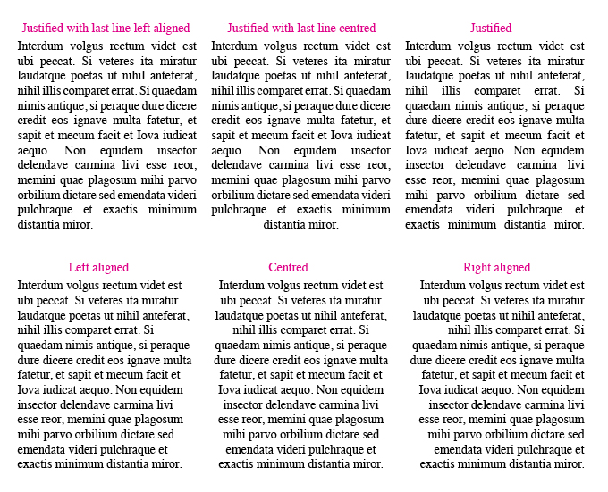
Recommendations
Avoid using multiple alignment settings as this will make your book look messy and unprofessional.
Only use justified alignment with hyphenation turned ON, and use good hyphenation techniques (i.e. setting minimum word lengths, the maximum number of hyphenations per paragraph, etc.). This will allow you to control the inconsistent spacing that occurs in the middle of lines with justified text (also known as text “rivers”).
6. Using an unsuitable font
With so many fonts available today it’s no surprise that many authors resort to the default fonts suggested by their word processor. While these are a “safe bet”, they limit your ability to match your font to the nature and tone of your book. In so doing, it can reduce your books’ impact.
Some examples of unsuitable fonts for book use
| Courier | Not proportional so will make your text look messy |
| Times New Roman | It’s the default for many word processors and so doesn’t stand out |
| Bodoni | Its high contrast makes it unsuitable for large blocks of small text |
| Slabo | Its square serifs make it blunt and unattractive for large text blocks |
| Arial | Overused and can be boring |
| Eurostile | A mixed style font that is neither one thing or another |
| Impact | A thick and heavy font that is too “shouty” for large blocks of text |
Recommendation
Choosing the right font is important because it affects both the readability and mood of your book.
As mentioned earlier under the “too many fonts” section, you should limit your fonts selection to a maximum of three.
Choose your font(s) with care, considering four main criteria: readability, suitability to the subject, relevance to the audience, and aesthetics.
For a more in depth analysis check out my article on font choice.
7. Ignoring hierarchy

Hierarchy is used in typography to denote the order of importance of different textual elements in your book for example Chapter titles, section headings and body copy.
As you can see from the (inset) Hierarchy can be established in a variety of ways. Common elements you can use to establish hierarchy include font change, text size, weight (bold, regular, or light), case (uppercase, title casing, or sentence case), spacing, and Contrast. Typically, the most important element is the biggest and boldest with the next most important information presented in a slightly smaller and less dramatic font. This design formula helps readers to scan the page and quickly pick out the most relevant information for their needs.
Recommendations
Missing or inconsistent hierarchy leads to confusion in the reader’s mind as they don’t know where to begin. If such a structure is appropriate, as is often the case in nonfiction books, establish it early on with an appropriate choice of fonts, styles and sizes and then use it consistently throughout your manuscript.
8. Overuse of emphasis
Emphasising certain words or ideas in your book can help your reader, but many authors tend to get carried away once they start down this road.
There are various ways to emphasise important ideas in your book such as bold text, underlining, italics and UPPER CASE.
Recommendation
Emphasis should be used sparingly so “less is more” should be your mantra. Also, don’t mix several forms of emphasis in the same passage. If your message isn’t clear, then consider rewriting it or adding a photograph, chart or diagram to provide an alternative form of emphasis.
9. Double spacing after the end of a sentence
Typographers use the term sentence spacing to refer to the horizontal space between one sentence and the next. It used to be common practice to add extra spaces after a full stop, but this practice has been phased out in printing since the middle of the 20th Century.
Recommendation
If you look online you will still find arguments about whether one space or two spaces is “correct.”
I would recommend that you use single spacing as there is no evidence that it has any detrimental effects, and it is the norm in the publishing industry. So make sure to check your manuscript and eliminate any additional spacing between sentences. If your book is particularly long, you may be pleasantly surprised to find that this trick could even reduce your overall page count.
10. Mismatching fonts
Consider the compatibility of your fonts. Fonts on their own can look great, but not all fonts play well together. It’s common to use different fonts for headings subheading and body text, and so it is important that you choose fonts that harmonise well.
Recommendation
When font matching, consider pairing a serif with a sans serif. It doesn’t matter which way round you use them (serif for body copy and sans for headers, or vice versa), but the contrast between the two styles will add a level of visual interest to your book and also aid in establishing hierarchy.
One fool-proof way to avoid clashing fonts is to choose two different styles of the same font, for example, Freight Sans and Freight Text. These fonts pairings have been designed to complement each other.
If you want a bit more variety though, here is a great comparison matrix that shows the most common Google Fonts and whether they work well together as heading and body copy combinations.

11. Not setting appropriate line lengths
Believe it or not, the number of characters on each line of your printed book has been shown to affect its readability. Lines that are too long cause your readers to have difficulty focusing on the text. Lines that are too short are also difficult to read. The reader’s eyes are forced to travel back to the start of the next line more frequently, breaking their natural reading rhythm and resulting in stress and fatigue. Various studies have come up with an optimal line length of between 50 and 75 characters.
Recommendation
Ensure that your book is as readable as possible by limiting your line lengths to between 50 and 75 characters.
For more information read my article about the science of how we read and its implications for book design.
12. Ignoring contrast
Contrast, as its name suggests refers to the difference between elements on a page. For example, the difference in colour between the text and the page background, or the difference between a big bold headline font and a smaller, lighter font used for body text. Research has shown that the image processing part of our brain likes contrast.
- Contrast is attractive
- Contrast helps us organise information
- Contrast creates a focus
Self-publishing authors who ignore the importance of contrast pay a price, both in terms of poor cover design, and overall readability. Thin grey fonts on a paler grey background may look good but can be hard to read.
Recommendations
Look for ways to add visual contrast to your book, in both cover design and interior formatting. But as with everything, don’t overdo it. The best place to start is by ensuring that there is enough contrast between your headings or chapter titles and your body copy.
13. Improper use of punctuation characters
Ask any proofreader what the most common mistake they come across is, and they’ll probably say punctuation mistakes, especially the dreaded apostrophe. From a typographer’s point of view, there’s more to it than correct grammar. Of course, you should check that you are using the correct punctuation for your sentence, but also think about HOW you are formatting your punctuation. Here are just some of the elements that a professional typographer will consider:
- The spacing between letters and punctuation characters.
- The use of ‘single’ and “double” quotation marks
- The position of a full stop (period) or question mark in relation to any associated quotation marks – inside or outside?
- The italicising of full stops, colons, semicolons and question marks if the word preceding them is italicised
- Dash lengths and the spacing before and after them
- The spacing before and after special characters such as © % &
Recommendations
The rules relating to the typesetting of punctuation characters often vary between nationalities. American typesetting rules are different from British English for instance. I recommend that, if you are going to do your own typesetting, do your research on punctuation best practice in your primary marketplace. Once you’ve settled on a set of ‘rules’ for how you are going to format your punctuation – apply those rules consistently.
In conclusion
Having read this article, you’ll now have a much better awareness of the most common typesetting errors and how to avoid them. You’ll also have an appreciation of how these small but important technicalities effect both the readability and credibility of your book.
If you only take two things from this article I’d like them to be:
That you remember the importance of visual consistency
The largest part of our brain’s information processing capacity is dedicated to sight. This means that even tiny inconsistencies in things like alignment, fonts, line spacing, and hierarchy get noticed, effecting our overall impression of the publication.
To consider the scale of the task
Ask yourself if you have the time, skill and patience needed to typeset your own book
Given the range of faux pas listed in this article and their potential for damage, wouldn’t it make more sense to let a professional like me do it for you?