
Scientists and philosophers since the time of the ancient Greeks have been fascinated by the incredible power of the human brain to decode markings into meaningful messages. Researchers have proposed, tested and discarded scores of theories in search of an answer to the apparently not so simple question of how we read.
Wait, What Does ‘How we read’ Got to Do with My Book?
Understanding the implications of the latest research on this topic can help you design a better book. One that is easier to read, and therefore more likely to sell. Self-published authors who are ignorant of these findings generally suffer:
- A loss of impact
A book that is hard to read will undermine your best endeavours to influence others, diminishing, rather than enhancing, its reach and impact. - Reduced sales
All other factors being equal, a poorly designed book will sell fewer copies than a well-designed one.
What is the Science of Reading?
There are two core aspects of reading: recognition of individual words and then associating those words together to decipher the context of a passage of text.
Word Recognition:
There are four main theories of how the brain recognises and interprets individual letters into words. Some theories are more robust than others, but all have a level of validity to them.
Theory 1 – Bouma Shape Recognition
The idea that we recognise words by the shape they make was first proposed by psychologist James Cattell in 1886[1].
Subsequent, more rigorous research, published in the late 1960’s and early 1970’s, supported Cattell’s findings, including extensive experimentation by Herman Bauma[2], a Dutch Vision Researcher during 1973.
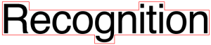
When letters are combined in words, the pattern of neutral, descending and ascending characters forms an overall shape envelope for each word. During his earlier research into the theory Cattell discovered the ‘Word Superiority Effect’[3], which demonstrated that people have better recognition of letters presented within words as compared to isolated letters and to letters presented within nonword strings.
Theory 2 – Serial Letter Recognition
Psychologist Philip Gough proposed an alternative model in 1972 in which he claimed that words were read letter-by-letter from right-to-left [4]. The serial letter recognition theory gained rapid popularity due to its simplicity and testability. It successfully predicted that shorter words are more rapidly recognised that longer ones, however, it couldn’t account for Cattell’s Word Superiority Effect and was discredited as a result.
Theory 3 – Parallel Letter Recognition
The emergence of technology which allows researchers to track a test subject’s eye movements with a high degree of accuracy led to a new theorem known as Parallel Letter Recognition.
The model generally states that that the letters within a word are recognised simultaneously, and that letter information is then used to identify words from a library of learned words[5]. This theory has superseded both the shape and serial letter recognition hypotheses and is currently the most widely accepted theory among cognitive psychologists[6].
Theory 4 – Neural Network Model
Recent advances in the science of the way our brain cells (neurones) work has given rise to an even more sophisticated understanding of how we read and process words.
The Neural Network Model proposes that various visual aspects of a word, such as horizontal lines, vertical lines, and curves, trigger word recognition receptors within the reader’s brain. Stimulation of these receptors, in turn, excite or inhibit neural pathways to other words in the reader’s memory.
Words with a similar visual representation to the observed word receive excitatory signals. Simultaneously, connections to words with a dissimilar appearance receive inhibitory signals. This combination of strengthening links to relevant words, and weakening associations with irrelevant ones, eventually activates the correct word as part of word recognition in the neural network[7].
Research supporting the Neural Network Model was published by neuroscientist Maximillian Riesenhuber, from Georgetown University Medical Centre, in March 2015[8]
Deciphering Context:
We have known since the late 19th century that the eye does not move continuously along a line of text when we read, but instead makes short rapid movements (called saccades) intermingled with short stops (called fixations).

A diagram demonstrating a typical saccadic eye movement
How Saccadic Eye Movement works[9]:
Eye movement studies using sophisticated eye-tracking technology indicate that we use three main areas of visual acuity when reading. The first area is centred on the fixation point and is where word recognition takes place. This area is usually large enough to capture the word being fixated as well as smaller function words directly to the right (such as ‘and’, ‘if’, ‘the).
The second zone extends a few letters past the fixation word and is used to gather preliminary information about the next letters in the sequence. The last area extends as far as 10-15 letters past the fixation point and is used to identify both the length of the following words and the best location for the next fixation point.

A diagram demonstrating the acuity of foveal vision in reading[10]
How Does This Research Relate to Book Design?
In the remainder of this article, I want to drill down into the various elements of book design to see how they relate to topics such as readability and comprehension.
Capitalisation
Research shows that most people read uppercase text 5-10% slower than standard sentence case content. The prevailing theory for this result is that we are not used to blocks of upper-case only text, and so it takes our brain longer to process than lower case text with occasional capitalisation.
Recommendation:
Use blocks of upper case text sparingly and ideally not within the body copy of your book. Try to only use it for single words that you wish to add emphasis to by making the reader subconsciously take longer over that word, or for headings.
Font selection
The font you chose can dramatically affect the readability of your text.
Serif versus Sans-serif fonts
There is much contention in the design world as to whether Serif or Sans Serif fonts are easier to read. However, the latest brain research suggests that, when it comes to readability, there is little solid evidence either way. So, choice of font classification generally comes down to personal preference, if you are mindful of how that font is used (more on that later).
Font design and readability
The advent of computers and digital typesetting has opened the door to a plethora of modern decorative fonts which, although more stylish, are often harder to read. Did you notice that all the scientific theories discussed above depend to some degree on being able to decipher individual letter characteristics? If the font you choose is so decorative that the letter forms are not immediately clear, it will take the brain longer to decide what each letter is, causing the reader to get fatigued and possibly lose interest.
Recommendation:
Use decorative or display fonts with considerable care, even when setting headings. These typefaces should only be used to add a particular mood or style to your book when that is required. Even then, you need to make sure that the text is still easily legible.
Font readability and perceived task difficulty
Research by Hyunjin Song and Norbert Schwarz of the University of Michigan[11] indicates that the harder a passage is to read, the more challenging the action written about will appear to be to the reader. By testing the reader’s reactions to the same set of instructions presented in either an easy, or a hard to read font, the researchers could show a direct correlation between readability and perceived task difficulty.
Recommendation:
If you want your readers to act after reading your book, it makes sense to choose a simple, highly legible font and set the text with minimal decorative features. This will make the text easier to understand and therefore reduce any subliminal barriers to subsequent application.
Font size
Now, having selected a font that is appropriate and readable you might think that your work is done, but you’d be wrong. The next thing to consider is the size of the font, also referred to as point size. You are probably familiar with the fact that you can change the size of your chosen font simply by selecting an option in the menu of your word processor. But have you stopped to considered to think about what is the ideal font size for the headers, subheaders and body copy in your book?
Clearly font size has an impact on readability. Why else do you think we have “small print” in most contracts. All other things being equal, the smaller the font size, the harder it is to read. But, on the other hand, the bigger the font, the more pages in your book, and the more expensive it will be to print. Research conducted at the University of Minnesota and the Rochester Institute of Technology[12] suggests that the minimum print size for readability is 9pt. However, it should be noted that the design characteristics of the font used can have an impact on this.
Recommendations:
I would recommend the following font sizes for most books, but remember to take your target readership into account when making your final decision.
- Body copy 9-12pt
- Chapter Headings 16+ pt
- Subtitles 12-14pt
Line length and readability
Font selection is not the only thing that affects readability. The number of characters per line (including spaces) has also been found to have a significant impact on legibility.
Research by the Baymard Institute [13]suggests that the ideal line length should be between 50-75 characters. Longer lines are harder to read because it is more difficult for the eye to take in where the line begins and ends. Shorter lines are equally difficult to read because they force the eye to jump around too much, disrupting the reader’s usual eye movement pattern, so it is important to strike a balance between the two.
Recommendation:
Make sure that your line lengths are between 50-75 characters. To achieve this, you need to balance several interlinked factors including page size, font, font size and page margins.
The Important of Spacing
The relationship between spacing (both horizontal and vertical) and the legibility of text was brought to the forefront in 2008 when two neuroscientists from the New York University published the findings of a study called “The Uncrowded Window of Object Recognition” in the scientific journal Nature Neuroscience[14].
One of the essential elements of spacing in book design is the choice of line spacing, the vertical distance between lines of text in your manuscript (known in the design industry as leading). Research has shown that there is a relationship between font size and line spacing (leading) that directly affects the readability of your book’s content. Most sources suggest that a good rule of thumb is to use a line spacing that is between 120 and 135% of the point size of your chosen font.
Recommendation
Based on my experience having designed many successful fiction and nonfiction books, I would recommend using a slightly wider leading then the default leading set by many word processors and page layout programs (in the region of 130% of your font size). For example, 13pt leading on 10pt text. This gives your text more breathing space and makes it easier for the readers’ eye to travel from the end of one line to the beginning of the next.
The horizontal spacing between the letters in the same line is the second element that has a significant effect on the legibility of your book. This is known in the design industry as Kerning. When letters appear crowded together on the page, it makes it much harder for the brain to separate and identify the letters and therefore the words that they make up.
Recommendation
The page layout program InDesign (which is the design industry standard for typesetting) has incorporated a function to set your kerning amount to ‘Optical’ automatically. This applies a mathematical algorithm based on the font used to ensure that there is enough space between each letter to be optically distinguished from its neighbours. This is ideal for large amounts of text; however, every good designer will recommend that titles and main headings be kerned letter-by-letter for the best results.
In Summary
Objective scientific research into how we read has reinforced what professional designers and publishers have known for years. That the typography of a book will have a significant impact on readability and comprehension, which in turn affects sales.
Typography is a combination of art and science. Finding the ideal blend of font, font size, line spacing, and letter spacing takes careful consideration, an understanding of the science of reading, and an artist’s eye to be able to blend the objective research with the aesthetic.
If you would like to discuss any of the topics in this article or explore how I can help you create a book whose design amplifies the meaning and readability of your text, please get in touch with me; I’d love to hear from you. (add link to contact us page)
[1] https://www.microsoft.com/typography/ctfonts/WordRecognition.aspx#m1
[2] https://en.wikipedia.org/wiki/Word_recognition#Bouma_shape
[3] https://en.wikipedia.org/wiki/Word_superiority_effect
[4] https://www.microsoft.com/typography/ctfonts/WordRecognition.aspx#m2
[5] https://www.microsoft.com/typography/ctfonts/WordRecognition.aspx#m3
[6] https://en.wikipedia.org/wiki/Word_recognition#Parallel_recognition_vs._serial_recognition
[7] https://en.wikipedia.org/wiki/Word_recognition#Neural_networks
[8] https://www.scientificamerican.com/article/when-we-read-we-recognize-words-as-pictures-and-hear-them-spoken-aloud/
[9] https://www.microsoft.com/typography/ctfonts/WordRecognition.aspx
[10] https://en.wikipedia.org/wiki/Eye_movement_in_reading#Saccades
[11] https://dornsife.usc.edu/assets/sites/780/docs/08_ps_song___schwarz_effort.pdf
[12] https://www.ncbi.nlm.nih.gov/pmc/articles/PMC3428264/
[13] https://baymard.com/blog/line-length-readability
[14] https://www.ncbi.nlm.nih.gov/pmc/articles/PMC2772078/


Some textbooks for post-secondary students are written by persons who have long ago been baptized by immersion into the history and importance of some obscure topic, one which is usually cloaked in mysterious language completely unfamiliar to the uninitiated.
After paying an outrageous price for a text the student may take a quick and random glance at the contents and sigh in despair, even if the typography is acceptable. As you know far better than most, most readers of any age are not aware of the impact of readability on both perception and enjoyment.
Please continue to feed us. We are hungry without knowing it.
I am creating a collection of 263 letters of my father’s from WWII. Deciding on type size is so stressful. I have two strong opinion- givers. One says Garamond 11pt. is “what the reader expects”. The 12 pt advocates says its easier to read and most older people will find it much easier to read. Any advice. I think the 11pt looks more tidy and professional.
Do you think 8.5 x 11 is an odd size for the book. There will be two versions – one plain vanilla with just the letters type. The other selected letters, history and commentary provided. One strong opinion is that they should look like a set even thought not everyone will get or be interested in it. all letters in 6×9 will be over 300+ pages not allowing for much white space between lines are at my left and bottom margins.
Thanks so much for your article and any advice you can give me. Elinor Biggs
Hi Elinor, thank you for your question. There are pro’s and con’s on both sides of the font size argument. 12pt is easier to read for older audiences (which a WWII history book are more likely to be), however it will make the book longer in page count (which may put some readers off). I am personally in the 11pt camp as it is more space efficient and looks more professional.
As for the trim size, I would say that 8.5″ x 11″ is too large for this type of book – unless you are planning on publishing it as a ‘coffee-table’ style book in hardback with photographs. But if it is going to be text only, then I would suggest going with the smaller size. Yes, it will end up slightly longer in page count, but it will be easier for people ti sot down with and read.
I hope that helps. Please feel free to book a consultation with me if you have any other questions or need any additional support.
Cheers, Sam Pearce