
A lot of authors who opt to typeset their own books ask me “what are the Best Fonts to use for my book”? And they invariably expect me to just give them the name of a font that they can then go and use knowing that it will be right.
Unfortunately, there is a LOT more to it then that. A number of different factors go into choosing the right fonts for your book. Such as subject matter, target audience, purpose of your book, how you anticipate readers will use your book. Even down to what budget you have available for printing and target cover price.
But I realise that for the average author who doesn’t have a background in graphic design or an understanding of typography, considering those sorts of questions in relation to font choice is a bit overwhelming. So, I’ve written this article to give you a really basic primer on the sorts of things you should consider when choosing your fonts. I’ll even give you a list of my favourite free-to-use Google fonts to get you started.
Why Font Choice is Important
Before we get stuck into looking at any particular fonts, lets look at why this decision is so important in determining the potential success of your book.
Back in 2017, I wrote an article titled “The Science of How We Read, & How to Use it to Build a Better Book” in which I went into the mechanics of how the human eye views and processes written words and how to format your book to make that process easier for your reader.
In the article I touched on several points related to font choice: style of font (i.e. serif, sans serif or display), font readability and how it relates to perceived task difficulty, and font size.
Style of Font
There is much contention in the design world as to whether Serif or Sans Serif fonts are easier to read. However, the latest brain research suggests that, when it comes to readability, there is little solid evidence either way. So, the choice between serif or sans serif generally comes down to personal preference. As long as you are mindful of how that font is perceived in terms of purpose.
Where the big distinction comes in is when discussing display fonts. The advent of computers and digital typesetting has opened the door to a plethora of modern decorative fonts which, although more stylish, are often harder to read. All the reading theories I discussed in the article depend to some degree on being able to decipher individual letter characteristics. If the font you choose is so decorative that the letter forms are not immediately clear, it will take the brain longer to decide what each letter is, causing the reader to get fatigued and possibly lose interest.
Font Readability & Perceived Task Difficulty
Research indicates that the harder a passage is to read, the more challenging the action written about will appear to be to the reader. By testing the reader’s reactions to the same set of instructions presented in either an easy, or a hard to read font, the researchers could show a direct correlation between readability and perceived task difficulty.
Font Size
Clearly font size has an impact on readability. Why else do you think we have “small print” in most contracts. All other things being equal, the smaller the font size, the harder it is to read. But, on the other hand, the bigger the font, the more pages in your book, and the more expensive it will be to print. Research suggests that the minimum print size for readability is 9pt. However, it should be noted that the design characteristics of the font used can have an impact on this. More on that in a moment.
So as you can see, choosing the right fonts for your book is an important decision that can have a direct impact on how readers will interpret and perceive your book. If you want to read the full “Science of How We Read” article, you can find it here: https://swatt-books.co.uk/the-science-of-how-we-read-and-how-to-use-it-to-build-a-better-book
My List of the Best Fonts for Books
So now that you understand why font choice is important, lets look at the options you have available to you.
I’m going to focus mainly on font choice for body copy as that is what 99% of your book will contain. I will add a few notes regarding how to best pair these fonts either with each other or with appropriate display fonts for headings and titles at the end of the article.
Serif
So, your first main option of font is Serif; these are the fonts with the little bits added to individual letters. They are also the most common choice for book body copy as they are the first types of fonts used in commercial printing.
Because of that history, serif fonts will give your book a more traditional feel. I will normally default to a serif font for books with a more serious subject matter where the author wants to be perceived as an authority on the subject. I tend also to use serif fonts for books that are longer in length where there will be a high number of pages with solid text unbroken by headings and subheadings (such as fiction or long-tail text books).
Merriweather
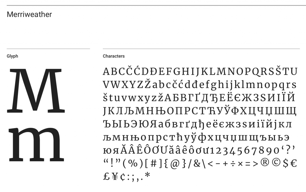
Merriweather is by far my favourite serif available from the Google Fonts platform. It was designed by font foundry Sorkin Type, and comes with a good choice of font weights as well as italic options. It has a generous ‘x’ height, which means text ends up being very legible without having to resort to larger font size. The letters are also very slightly condensed which means that it a very space efficient font. Just note that the numerals of this font are in an oldstyle format, so some aspects of certain numbers will sit slightly below the baseline. Merriweather also has a sans serif version which makes font pairing very easy for novice typesetters.
EB Garamond
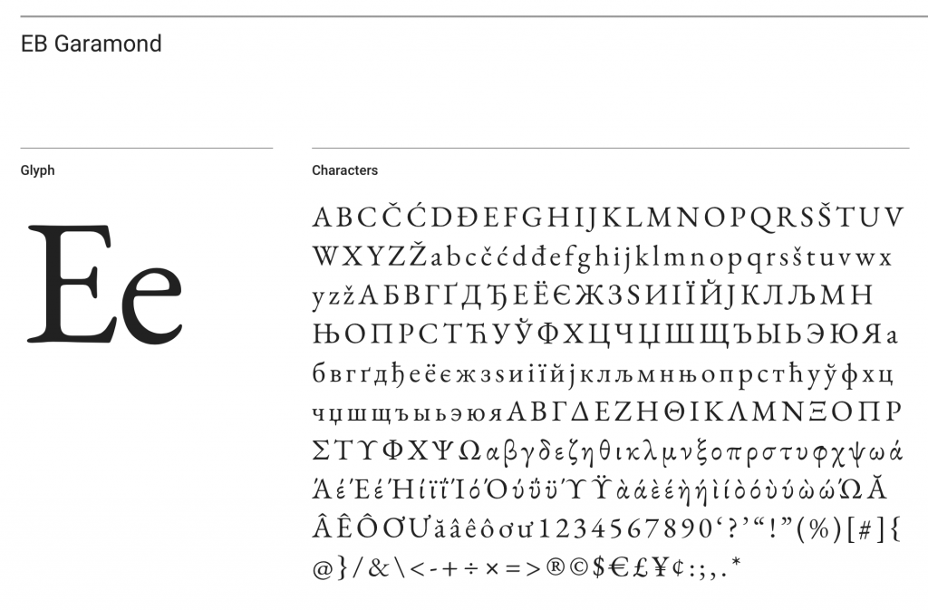
EB Garamond is intended to be a modern revival of Claude Garamont’s famous 16thcentury humanist typeface ‘Garamond’ designed by Georg Duffner and Octavio Pardo. Due to it’s classical roots, EB Garamond is a very traditional style font and is great for authors looking to add a classical feel to their book. It contains an extensive character set including Greek so is ideal for scientific or mathematical subjects. There are a wide range of weights and italics available in the set but be mindful that this font has been designed to give italics the impression of being slightly larger than non-italic text.
Lora
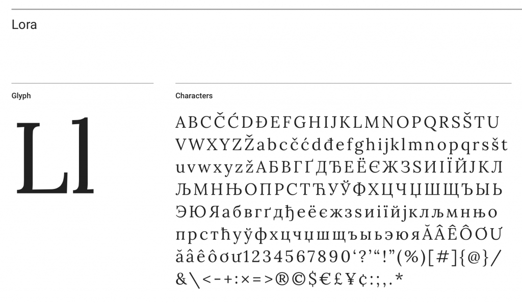
Lora is a well-balanced contemporary serif with roots in calligraphy designed by font foundry Cyreal. It is a text typeface with moderate contrast that is well suited for large amounts of body text. Its calligraphic background gives the little finials (the bits that make up the serifs) a much softer feel then some of the more traditional serif fonts. This makes it ideal for more personal or artistic subjects. Just note that it is only available in 4 styles.
Playfair Display
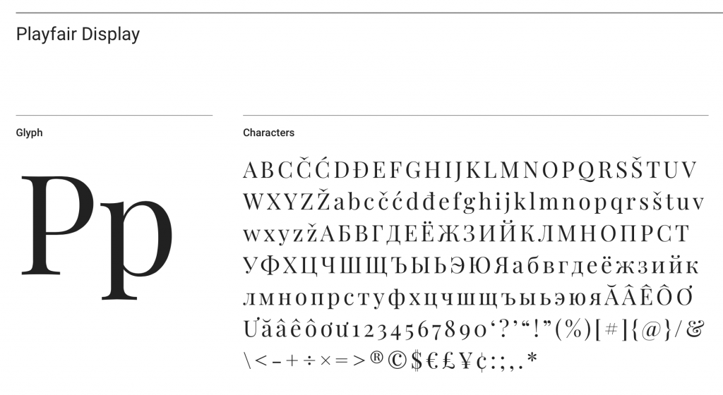
Playfair is a very high contrast font which means that there is a large difference between the thick and thin parts of each letter. Generally, this would mean that it wouldn’t be suitable for small text sizes, however this particular font also features a generous ‘x’ height similar to Merriweather, so that text set in Playfair is still easily legible at common body copy sizes. It was designed by Claus Eggers Sørensen as a modern twist on fonts popular during the Art Deco period of the late 18thcentury such as “Baskerville”. It features a good number of various styles and weights and when you download the full font set also comes with a dedicated small caps version as well as a set of discretionary ligatures (where certain common letter pairs such as ‘th’ and ‘st’ are joined together) which can give text a very distinctive character.
Crimson Text
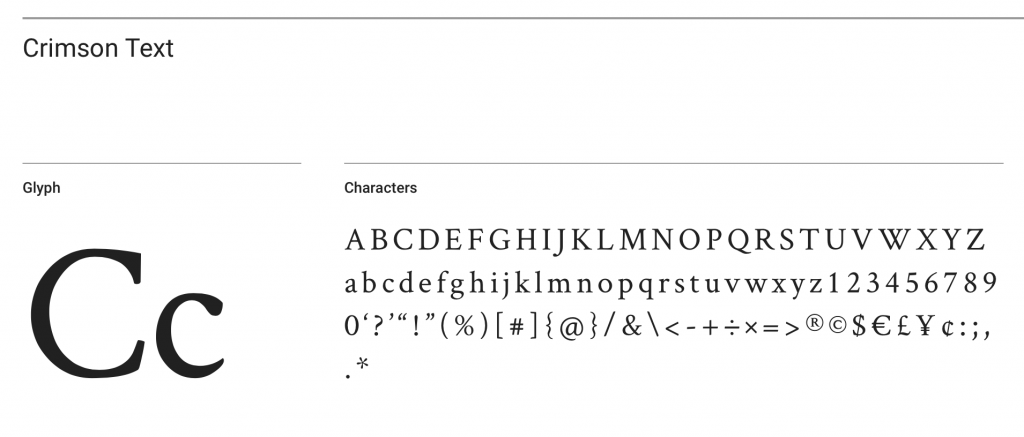
The final serif in my list of favourites is Crimson Text, which is a beautifully elegant oldstyle font designed by Sebastian Kosch specifically for book production. It is very easy to read and as a font set comes with a number of little niceties such as oldstyle numerals, small caps and mathematical symbols. There are a total of 6 styles and weights available, and it makes for a great text ‘workhorse’.
San Serif
Your second main option of font is Sans Serif; and unsurprisingly these are the fonts without the little bits added to individual letters. They are a bi-product of the digital age and were developed because original computer screens just didn’t have the pixel density to render minute detail.
Because of their origins, sans serif fonts will give your book a more modern and contemporary feel. I will normally revert to a sans serif font for books with a more contemporary subject matter or books where the author wants a modern look.
Monsterrat
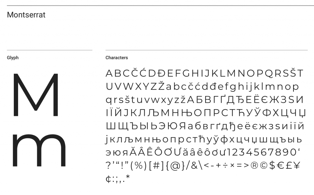
Monsterrat is one of the more elegant sans serif fonts in my opinion and was inspired by turn-of-the-century urban typography posters in Buenos Aires. Monsterrat comes in a large number of weights and styles and lends itself to a wide variety of uses from main headers through to body copy and small print. The font has a full set of Cyrillic and Greek characters and also has a set of Alternates and dedicated underlined sister fonts which makes it extremely versatile.
Raleway
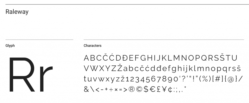
Raleway is an elegant sans serif font original intended for headings and other large text size uses. Initially designed by Matt McInerney as a single thin weight, it was expanded into a 9-weight family by Pablo Impallari and Rodrigo Fuenzalida in 2012. Because of its large ‘x’ height, it can also be used for body copy as long as you set it with generous line spacing.
Roboto
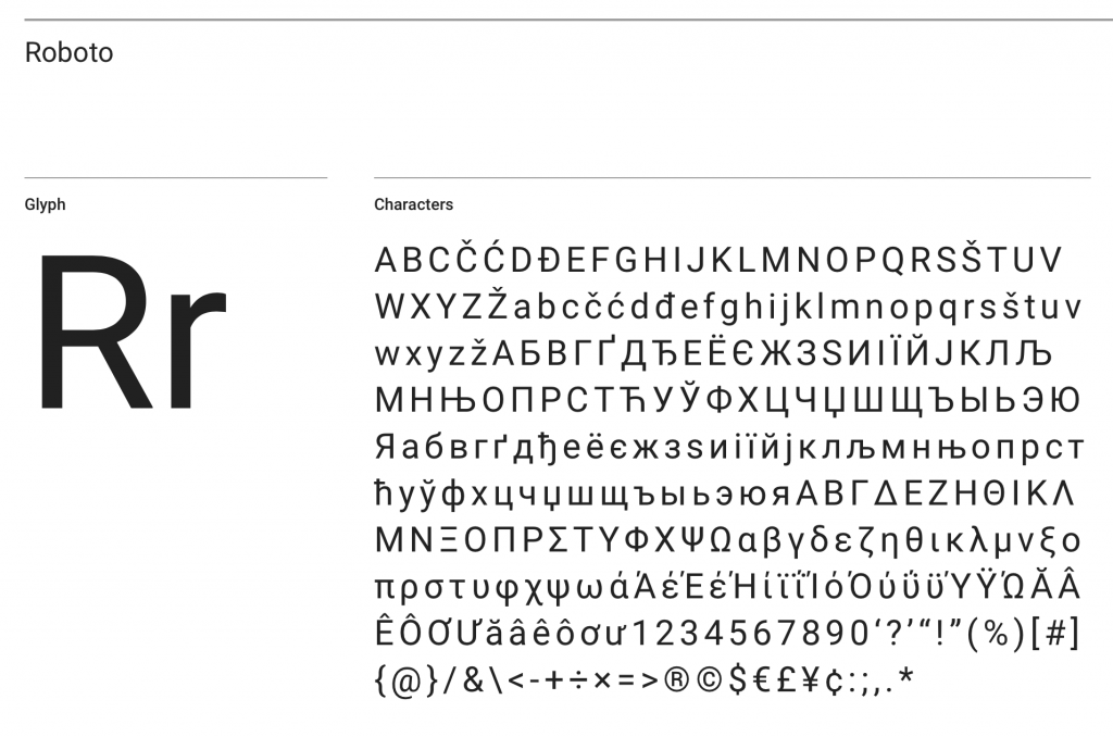
Roboto is a great sans serif font for portraying strength and masculinity. It has a very geometric structure; however, the overall proportions of each letter have not been forced into a set width which makes for a more comfortable reading experience. It was designed by Christian Robertson and features a large number of weighs and styles as well as Condensed and Slab sister fonts that make font pairing very easy.
Oswald
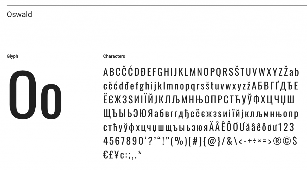
Oswald was initially designed to better fit the pixel grid of standard digital screens, hence it’s slightly condensed appearance. This condensed structure makes it ideal for main titles and headings, however as it does not contain any italic styles so it’s not suitable for large amounts of body copy. Despite missing any italic options, Oswald does come in 6 different weights making it very flexible for books with extensive heading hierarchies.
Open Sans
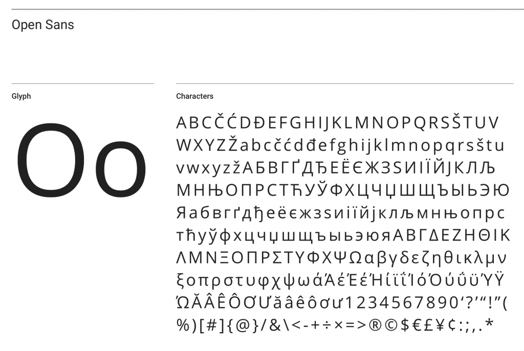
My final sans serif font of choice is Open Sans which is what’s known as a ‘humanist’ font (which basically means that they are more organic and have a more handmade feel without being decorative like scripts). It was designed by Steve Matterson and boosts an extensive 897-character set including all standard Latin, Greek and Cyrillic letters as well as a wide range of symbols and glyphs which makes it ideal for foreign language translations and math/science-based subjects. Unlike many sans serif fonts, it has been optimised for print as well as web and mobile and has excellent legibility.
Conclusion
So, there you have it; my list of top 10 best fonts for books. I want to leave you with a quick insight into how to pair your fonts – which is the process of matching different fonts within the same design. I will most likely go into more depth on this subject in a future article, but here are a few basic tips to get you started.
- Pairing a Serif with a Sans Serif is always a great trick for adding variety to your book and making headings really stand out without having to resort to large font sizes.
- Look for fonts that have a wide variety of weights and styles so that you have plenty of option to play with contrast between headings and body copy.
- Consider fonts that have sister fonts within the same family (such as Monsterrat and Monsterrat Sans, or Roboto and Roboto Slab) as they have been designed specifically to work together.
- When in doubt, see what other people have paired their fonts with. Google Fonts has a great feature of providing suggest font pairing for the majority of their fonts, though they tend to be limited to their most popular options. If you want a bit of variety, check out the website FontPair (https://fontpair.co) which has a huge list of suggested font pairings of Google Fonts and is a great site I use when needing a bit of extra inspiration.
I hope you found this article useful. If you have a favourite combination that you like to use, let me know in the comments. It could inspire other authors too.


I have read “the HOUSE of MORGAN” by Ron Chernow and that font is very readable,
but I don’t know what font and what font size it is.
Also, “John Marshall Definer of a Nation”, by Jean Edward Smith is very, very readable,
but again I don’t know what font and what font size it is.
Can you help me – or direct me to a place I can find out. I have looked on the first pages
of these books, but they don’t say. Thanks
Hi Robert, yes it is extremely rare to find a publisher that will list font usage within their books. The quickest way to find out what font has been used in a particular book is to take a clear, straight-on, close-up photograph of a selection of the text and upload it to https://www.myfonts.com/WhatTheFont/. I hope that helps.
Thanks, I really appreciate your time. I will do it.
Very good article. Do you know a font which is similar to the new COMFORT PRINT Typeface of Harper-Collins Bibles? It has good readability and space efficiency.
Thanks.
Hi Antonio, thank you for the question. The font you are referring to is called “Thomas Nelson KJV” designed by 2K/DENMARK. As it is a fairly new font and was a private commission by Thomas Nelson (who are the stewards of the King James Version of the bible) there is very little information available about it. I’m afraid without a sample it would be difficult for me to recommend a font that has similar characteristics.
Really helpful article, thank you.
I wrote a novel that was set in two different time spaces – so the structure was a modern chapter followed by a historical one, then a modern one and so forth.
So I used a Serif for the historical chapters and Sans Serif for the modern ones.
Feedback from readers suggests that they found it a really helpful differentiator. Especially those readers who only wanted to read the modern chapters or the historical story and not the whole book!
Thanks for your kind note.
They cell it the “Comfort Print” typeface, but unfortunately I do not have a prited Bile either tjhe New Revised Standard Version or the New Revised Standard Version – Catholic edition to take a photo and send it to you.
Anyway, thanks a lot and best wishes.
Tony
Thank you very mucho for your kind answer.
The fonts Thomas Nelson are using for their New Revised Standard Version, both Protestant and Catholic Editions is from commissioned 2K/Denmark Klaus Kreigh font and is named by them “Confort Print” and they state it has high readability, space efficiency, sturdiness and small sizes posibility. They state they saved 300 pages of bible printing just on that font change.
Monserrat not Monster Rat 🐀😄
LOL. I used to think it was Monserrat as well, but is in fact “Montserrat”… check out the spelling on the Google Font listing https://fonts.google.com/specimen/Montserrat)
A good copy editor is important as well. 🙂 Thanks for the article very informative.
Great selection of fonts! It’s amazing how the right typography can elevate the overall look of a book. I especially loved the suggestions for serif fonts – they really do add a touch of elegance. Can’t wait to try these out for my own writing!
Great insights on font choices! I never realized how much a font could impact the overall look and feel of a book. I especially loved your tips on pairing fonts effectively. I’ll definitely be trying out some of these suggestions for my next project. Thanks for sharing!