Let’s be honest, not every author can afford to have their book designed and typeset by a professional. For those authors on a tighter budget, producing your own book artwork is entirely feasible, but there are some common book design mistakes that you need to be aware of and try to avoid.
In this article, I’m going to look at the 5 most common book design mistakes that I see and give you some tips and advice as to how you can avoid making the same mistakes with your next book.
Book Design Mistake #1: Pagination
If you are producing your book used a word processor like Microsoft Word, it’s very easy to lose sight of the fact that a printed book is a three-dimensional object – it has a left and a right-hand page when open. Where your content falls in relation to this left hand/right-hand layout is referred to as Pagination.
One of the book design mistakes that I see most often is books that don’t take this left-hand/right-hand layout into account. It’s very easy to spot books that make this mistake; page numbers or headers and footers might move from one page to the next, margins might shift left or right and then back again.
The good news is that this is a fairly easy mistake to avoid. Here’s how:
- Remember that traditionally odd-numbered pages sit on the right-hand side of the spine, and even-numbered pages sit on the left.
- Book content always starts on a right-hand page (even if that first page is not numbered as page 1).
- To make things simple for yourself, align page numbers as well as headers and footers to be centred on the page, ideally between your margins.
- For books of 150 pages or less, you can use the same margins left to right as long as they are at least 9.6mm or more.
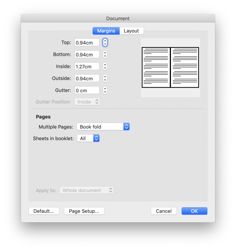
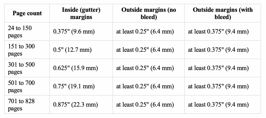
- For books of more than 150 pages, you will need to set the inside (that’s the one that sits against the spine) to be wider than the outside margin. To do this in Word, go to Format > Document. Select “Book Fold” for the Multiple Pages option under Pages, and then set your Inside and Outside margins accordingly. See below for a table of MINIMUM margin requirements as recommended for Amazon KDP compliance to give you a guide of what margins you should be using.
Book Design Mistake #2: Headers/Footers
The next common book design mistake that I see most often relates to a books’ headers and footers. Book headers and footers traditionally consist of the book title, author name, and page number. In non-fiction books, they often also include chapter or section titles to aid readers in navigating through the book.
I quite often see books were these headers and footers have either not been applied consistently in terms of their content or their location shifts slightly on the page.
As with Pagination, mistakes with headers and footers are fairly easy to avoid, just follow these simple tips:
- Make use of the Headers/Footers feature in MS Word by double-clicking either the very top or bottom of any page.
- Do not manually type in page numbers; let Word add them automatically by using the page number options inside the Headers/Footers formatting window.
- If you are including chapter/section titles in your headers/footers, be sure to update the Header/Footer content at the start of each chapter or section.
Book Design Mistake #3: Font Choice
This next book design mistake has a couple of different facets to it – one that is fairly straight forward, but one that is a little bit more arbitrary and personal – but they both relate to the choice of fonts that you use to typeset your book.
The more clear-cut mistake regarding font choice is a book that uses too many different fonts and font styles. Books that exhibit this mistake tend to make readers feel a bit confused, overwhelmed or just plain distracted from the content. It makes a book look messy and not very coherent.
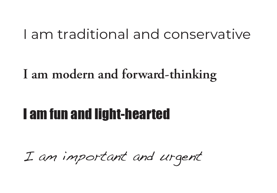
The font-related mistake that has a bit more grey area around it is that of the actual fonts you choose and how they relate to the content, purpose and message of your book. Fonts can have a profound subliminal effect on a readers’ interpretation of your message. You can be saying one thing, but your choice of fonts could be giving the complete opposite impression. Take the examples shown right for instance.
Avoiding font-related mistakes can be a bit tricky for some, especially if you’re not very visually creative, but following these basic guidelines will help:
- Keep the number of fonts that you use to a maximum of 3, but ideally to 2. Then use different weights and styles within those fonts if you want to get more creative.
- Make sure that the two-three fonts that you choose work well together a don’t clash. If in doubt, try looking for a ‘superfamily’ of fonts; these are serif and sans serif fonts created specifically to go together (check out this collection of Superfamilies from Google Fonts).
- Think carefully about your target audience and the message that you want to convey to that audience, then try to select fonts that reflect that message.
- For more guidance on how to choose fonts for your book design, check out my article Why Font Choice is So Important in Book Design.
Book Design Mistake #4: Formatting Consistency
The fourth in my list of book design mistakes is one that tends to send my OCD into overdrive… and that is a lack of consistency of text formatting.
In any type of visual design, consistency is king but is especially important in book design. A lack of consistency can make a book look messy and in the case of non-fiction books can be confusing for the reader. If you start your book formatting quotes in italics with no speech marks, and then later switch to regular text with speech marks, will your reader recognise it as a quote? If they are specifically looking for a quote in your book, they might skim over it because it’s not formatted as they expect based on the quotes they saw earlier in the book.
To avoid making mistakes in the consistency of your formatting is fairly easy to do, but it takes some planning. Here is my recommended workflow to keep your formatting consistent from Introduction to Conclusion:
- Before you start typesetting your final book, skim through your entire draft manuscript and make a list of the different types of formatting your book will require. Be sure to look at both paragraph and character formatting.
- Go through your list and decide how you want each style of formatting to look like. It’s best to open a new Word document and format a selection of copy in each style.
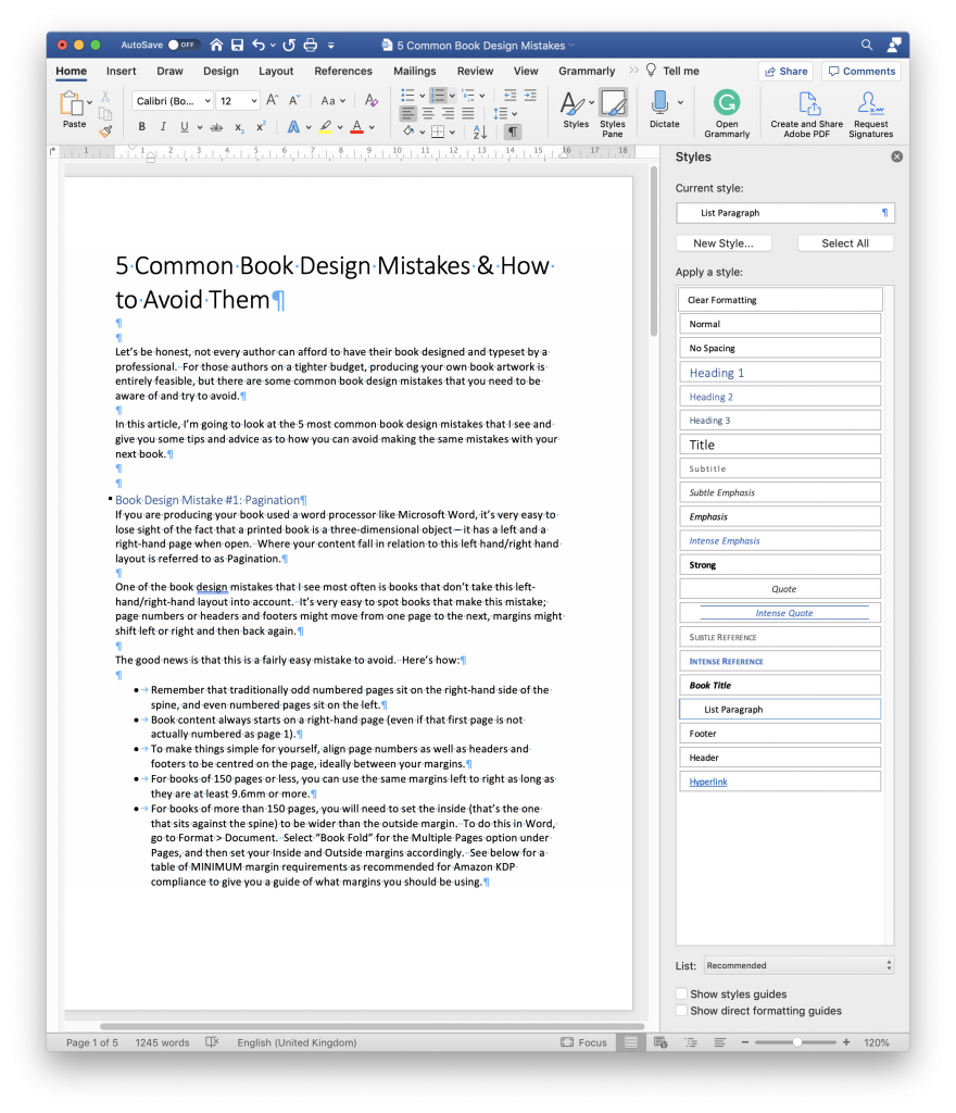
- When you are satisfied with how each style looks both in isolation and relation to the other styles, save each type of formatting as a Style in Word by opening the Styles Panel accessible from the Home menu at the top of the screen.
- After you have each formatting style saved, delete all of your formatting text and copy in your draft manuscript. Systematically work through your book page by page formatting the content using ONLY the styles that you saved.
Book Design Mistake #5: Alignment
This final book design mistake is a fairly minor one in the grand scheme of things, but if you can avoid it will make your book look that much more professional; and that is text alignment.
Though there is nothing wrong with left-aligned text, a book where there are pages and pages of text with a ragged right can look messy and could potentially give your reader a headache after a while.
This also applies to your left-hand alignment. If your book contains bullet points, numbered lists or sections of indented text, you don’t want that left-hand alignment changing from page to page. Again, it adds to the messiness and makes it more difficult for the reader to comfortably read your book for extended periods if their eye has to keep shifting to find where new lines start.
This last book design mistake is also a fairly simple one to avoid, just follow these simple guidelines:
- Format all paragraphs of body copy using Justified alignment to ensure straight edges on both sides of your text.
- Use a consistent amount of indentation on all bullet points, numbered lists and indented text.
- And be sure to add that indentation amount to your formatting Styles (as discussed above) to guarantee consistency through your book.
Conclusion
I always advocate hiring a professional designer to design and format your book. They will instinctually know how to avoid all of these common book design mistakes and many more that I have not mentioned.
However, if you just do not have the budget to pay for a professional, then following these tips will help you produce a book that is consistent, easily readable, and to a high enough quality that it will be judged on its content and not on how it looks.
If you have any other design and formatting suggestions, I’d love to hear about them. Drop your tips and ideas in the comments below.