Clearly, writing the manuscript for your book is a critical first step on the road to becoming a published author, but there are other essential elements that you should think about if your book is to be successful. These include editing, interior layout, typesetting and formatting, as well as cover design.
In this article, I’d like to share some ideas to help you appreciate the importance font choice makes to the overall success of your book.
It may surprise you to know that there are 32,000 font families (typefaces) in existence at the time of writing this article, so it’s no wonder that choosing the best one causes many authors so much angst. Thankfully there are some simple criteria that you can use to whittle this bewildering array down to a manageable shortlist. Let’s look at each of these criteria in turn and see what it means and how it affects our font choice. But first, a brief introduction to fonts themselves.
Fonts 101
Fonts typically fall into four main categories – Serif, Sans-Serif, Script and Display. The first fonts used by printers were influenced by the handwriting of the period. Each character was separate but had little flourishes at its edges, called serifs.
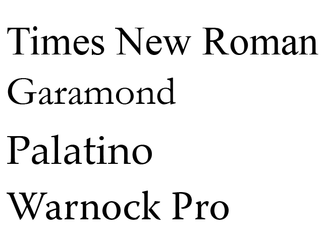
In the high-resolution world of printed materials such as books, these serifs make each letter distinctive and therefore easier for our brains to recognise and read. They also help our eyes to flow from one letter to the next binding individual characters into words. One of the most common serif fonts is Times New Roman, which was commissioned by The Times newspaper in 1931 specifically to improve the readability of its publication.
However, this generalisation does not necessarily hold true for digital displays. The lower resolutions of computer monitors, coupled with some of the thinner elements of serif characters can make Serif fonts harder to read on screen.
As a result, a new category of fonts started to appear called Sans-Serif (from the French word “sans” meaning “without”). These fonts had the flourishes removed, and the thickness of each stroke evened out to create letterforms that were more conducive to digital reproduction.

The introduction of computer typesetting eliminated the need for each letter to be a separate block as was required for traditional letterpress typesetting. And so it became possible to create Script fonts that more closely emulated the flowing connected letters of handwriting.

This new freedom also allowed font designers unlimited creativity when crafting new typefaces, and brought about the advent of the final category of fonts; known by various names including Display, Decorative or Novelty. While these decorative fonts certainly stand out, their focus on form over function makes them unsuitable for large blocks of text. They should, therefore, be used sparingly.

Choosing a Font for your Book
So, let’s look at how to best go about choosing fonts from the vast array available to you. There are 4 key criteria you should consider when selecting a font, and I would recommend going through them in the order I have them listed here. Applying each criterion to your list will enable you to strike off those not suitable for your book until you are left with a short list of fonts that will work. It’s then down to personal taste after that. The 4 key criteria are:
- Readability
- Suitability to Subject
- Suitability to Audience
- Aesthetics
1. Readability
It’s a fact that some fonts are easier to read than others so it should come as no surprise that the typeface you choose for your book could influence its success on several levels. Imagine yourself flicking through a book you have picked off a shelf and having difficulty reading it? It’s unlikely that you are going to buy it, right?
Now let’s say you have purchased a book online (where you weren’t able to flick through it first). As you are reading it, you start to get headaches from having to concentrate a bit harder because the font choice and formatting just isn’t as polished as it should be. Chances are you are not going to finish the book, or if you do, you’re not going to enjoy it as much and possibly leave it a bad review.
Both scenarios negatively influence the success of your book. By ignoring the readability of your font choices, you either risk not selling many books or getting poor reviews which in turn could negatively influence future sales.

Top Tip:
Pay very close attention to how readable your chosen fonts are, and especially how they read in a large block of text. Most font management programs like Suitcase or Font Doctor allow you to preview a sample passage of text (such as a poem) in any chosen font. Google Fonts also offer the same feature, which is a great place to get some initial inspiration. I am not going to make any specific recommendations on which fonts to use at this stage but will return to this subject later in the article once we have reviewed the other criteria that you should consider before making your ultimate decision.
2. Suitability to subject
Surprising as it might seem, some fonts suit some topics more than others. Indeed, many fonts have been specifically designed to convey an impression independent of the words they are used to form. These perceptual differences give rise to the possibility that choosing the wrong font could lead to a mismatch in your reader’s mind between the literal meaning of your words and the visual impression conveyed by your choice of font.
This concept can be a little hard to grasp so here are two examples that might help.
As its name suggests, the font Comic Sans was inspired by the kind of lettering often used in comic books. Its purpose was to give a casual, relaxed impression suitable for speech bubbles, which make it inappropriate for a serious topic such as a book on will-writing or the memoirs of a war vet.
On the flip side of the coin, take a font such like Palatino, which was designed to mirror the letters formed by the broad nib pens used by calligraphers of the 18th century. It would look out of place if used to typeset a satirical comedy or futuristic sci-fi thriller.

Top Tip:
Make sure that the font you choose for your book is appropriate to its subject matter. To help you do this, look at other books on similar topics and note which fonts they use. Some larger publishers make this easy by listing the font used in the front of the book on the page where they show the publishers details. Alternatively, there are various online tools such as an app called WhatTheFont which makes it possible to identify a font from an image captured by your smartphone camera.
3. Suitability to audience
Another factor to consider when choosing a font for your book is the nature of your target reader. To understand what I mean let’s use a fashion analogy. If you were going out to the beach on the weekend with your friends, would you wear the same clothes as you would if meeting an important client in the head office of a blue-chip company? You’d dress to suit the circumstances, wouldn’t you?
Well, the same principle holds true when you choose your font. Always make sure you choose a font that is appropriate for your primary readership. Take age for example. Sans-serif fonts are often preferred by younger readers because of their simpler shapes and modern feel, whereas an older audience will be drawn to a more traditional serif font.
By choosing a font that is inappropriate to your audience, you risk putting them off buying your book. For example, a successful entrepreneur may think your book is not serious enough, or a stressed-out university student who just wants a relaxing romance novel to take her mind off studying may think your book is too serious.

Top Tip:
When choosing a font for your book, try and put yourself in your readers’ shoes. Who are they, what are their lives like, what will appeal to them, and what do they hold important? These things can point you in the direction of a design style that will resonate with them. Once you have a persona of your reader in mind, go through your list of fonts and see which ones fit that image.
4. Aesthetics
As well as considering the basic readability of your font choices, I believe it’s also important that you think about more subjective elements such as perception and beauty. These topics are collectively referred to as Aesthetics and depend very heavily on personal taste.
This criterion is all about gut feeling. Does the font feel right? Does it give your book the sense of quality that you are looking for? Is it beautifully balanced? Is it interesting?
If you have considered all the previous criteria carefully, there are no right or wrong choices when you get to this stage. The only word of warning that I would give you is to bear in mind whether your personal persona is representative of your target audience or not. If you’re not, then your personal tastes should not play as important a role as those of your readers. But at the end of the day, it is YOUR book, and you must be happy with the results, or you are less likely to put your all into selling it.
Top Tip:
Think about whether you are your target audience or not. If you are, then chose a font that works for you. If you are not, then get the opinion of someone who IS your target audience. Which of the fonts in your shortlist do they like? Don’t forget to ask ‘why’ they prefer one to the other. Even if they are not 100% sure of the answer, the insight will help you design better books in the future.
Recommendations:
So, now that you know a bit more about what to consider when choosing a font for your book, I want to share a few of my personal favourites with you as well as a few fonts to avoid. This list is by no means exhaustive but, if time is limited, you can choose a font from this list, safe in the knowledge that it will serve your purpose well.
Note: I have intentionally kept this list to fonts that are common on most modern computers as well as some available for free through Google Fonts.
| Recommended fonts: | Fonts to avoid: | ||
| Font | Usage Comments | Font | Usage Comments |
| Garamond (serif) | A professional looking serif font that is clean, legible, and well balanced. Garamond has a more classical feel that will suit a serious subject.
| Courier
(Serif) | This font was designed to look like the output from an old-fashioned typewriter is supposed to radiate dignity and prestige, but as it isn’t proportional, it can make your book layout look messy. |
| Georgia
(Serif) | A less commonly used alternative to Garamond.
| Times New Roman
(Serif) | This is an elegant, classy font but it is the default for many word processors. I think there are better, more distinctive alternatives. |
| Caslon Old Face
(Serif) | This serif font is used for the main text in many books thanks to its excellent readability and comfortable and inviting feel. Just be aware that it has a very traditional look that can make large amounts of text look dated, but is perfect for any sort of period topics.
| Bodoni
(Serif) | Due to its high contrast between thick and thin strokes, Bodoni can be very hard to read in large amounts. If the Art Deco feel of this font suits your subject, consider only using it for headlines. |
| Merriweather
(Serif) | Even in lighter weights, Merriweather has a solid, dependable feel to it that will lend text a feeling of authority. It is also very easy to read, so good for older readers or those with poor eyesight.
| Slabo
(Serif) | Slabo is what’s known as a ‘slab serif’. It has serif flourishes, but they tend to be very square and blunt. This bluntness can make for unattractive blocks of text and can give your book a sense of ‘don’t care’ about it. |
| Helvetica
Sans-serif) | A more creative alternative to the Aerial which, as a sans-serif font, is appropriate for titles and subtitles. | Arial
(Sans-serif) | This is a very common font, and many designers think that it has been overused. I personally feel it lacks character and can be boring.
|
| Open Sans
(Sans Serif) | This is a great sans-serif font that combines some of the traditional letter shapes from serif fonts (such as the bowl of the lowercase ‘g’) with the modern readability of a sans-serif.
| Eurostile
(Sans-serif) | This font has an odd mix of modern and traditional letter forms and so can be a bit confusing regarding suitability. |
| Century Gothic
(Sans-Serif) | A great alternative to Helvetica or Arial that tend to be overused. It has a very round and open feel to it that makes it very modern. Just be wary that it can be space hungry, so use with slight negative tracking.
| Impact
(Sans-Serif) | This font, even in it’s lightest weight, is very thick and heavy. It can come across as very “shouty” and will look very intimidating set in large amounts of text. |
| Roboto
(San-Serif) | This is a very clear and concise font that is easy to read in all weights and is ideal for both headings and body copy.
| Gill Sans
(Sans-Serif) | Gill Sans has a couple of letters within it’s set that also contain serif flourishes (such as the lower case ‘a’). In some fonts, this works, but with Gill Sans I find they stand out and can come across as a mistake.
|
Making your final decision
Ultimately, choosing the font for your book is a subjective decision. To help you do this, I would recommend that you draw up a shortlist of two to three fonts that you like and then have your designer typeset a few sample pages in each of your chosen fonts.
Even slight differences between individual fonts become much more noticeable when you see them as a large block of text.

And remember to print those samples out, as fonts can look, read and feel very different on screen compared how they look when they are printed.


Excellent content. I love it. Helped me loads.